
Common Squarespace Design Mistakes to Avoid
A Squarespace website can look professional without complicated design, but small design mistakes can make even a good template feel confusing. The most common problems are usually not technical. They come from too much content, weak visual hierarchy, inconsistent styles, unclear calls to action, and layouts that were never checked on a real phone.
This guide covers common Squarespace design mistakes and shows practical ways to fix them while keeping the site simple and easy to maintain.
1. Adding Too Much to Every Section
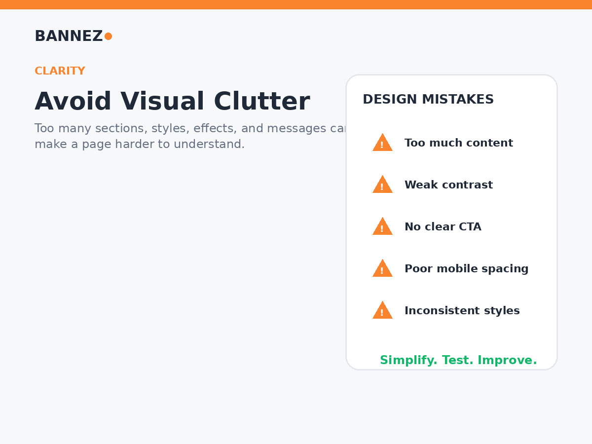
One of the easiest ways to weaken a design is to put several messages, images, buttons, icons, and decorative elements into the same section.
How to fix it
- Give each section one main purpose
- Remove repeated information
- Use whitespace between ideas
- Move detailed information to a dedicated page when needed
- Keep the main action obvious
Squarespace’s official page sections documentation explains how sections can be organized and managed.
2. Using Too Many Fonts
Several unrelated fonts can make a business website feel inconsistent. Typography works best when visitors can immediately distinguish headings, subheadings, and body text.
A simpler approach
Use one strong heading style and one readable body style, or one font family with a small number of weights. Keep the same typography rules across all major pages.
3. Using Too Many Colors
A different color for every section creates visual noise and weakens the brand. Build a small color system instead.
Use colors by role
- Primary brand color
- Accent color for important actions
- Neutral background colors
- Readable text colors
Strong contrast matters more than having many colors.
4. Weak Visual Hierarchy
If headings, paragraphs, buttons, labels, and secondary text all look equally important, visitors do not know where to look first.
Create a clear reading order
- Main headline
- Short supporting message
- Important visual or proof
- Supporting details
- Clear next action
5. Unclear Calls to Action
A page can look excellent but still fail if visitors do not know what to do next. Avoid filling one section with several equal-looking buttons that compete for attention.
Improve CTA design
- Choose one primary action per important section
- Use specific button text
- Keep primary button styling consistent
- Place the action after enough information to support the decision
Examples include “Book a Consultation,” “Request a Quote,” “View Services,” or “Contact Us.”
6. Writing Long Walls of Text
Large paragraphs are difficult to scan, especially on mobile. Break complex information into short paragraphs, H2 and H3 headings, bullets, checklists, or simple tables.
Squarespace content blocks can support different content types. Its official blocks guide explains the available content-building approach.
7. Using Generic Template Content
Templates are starting points. If you keep sample wording, stock images that do not match the business, or sections that exist only because the template included them, the website can feel generic.
Replace template content with
- Your real services
- Real business information
- Relevant images
- Actual customer questions
- Accurate calls to action
8. Making the Header Too Large
An oversized logo or header can use too much screen space and delay the useful content below it. Keep the header clear, compact, and easy to navigate.
Header checklist
- Logo remains readable
- Navigation labels are clear
- Important page is easy to reach
- Contact or booking action is visible where appropriate
- Mobile menu is tested
9. Ignoring Mobile Design
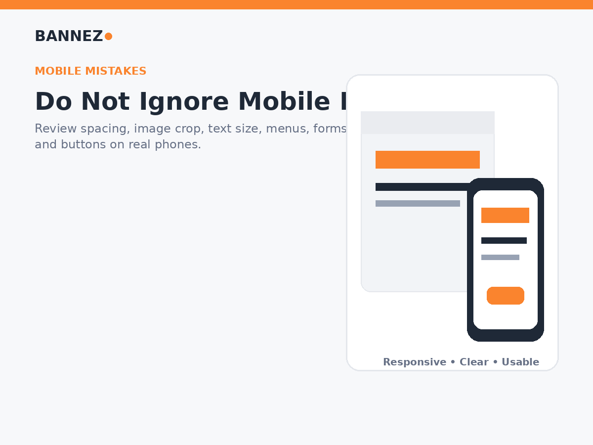
Squarespace uses responsive design, but your content still needs review on real smaller screens. Long headlines, unusual image crops, large spacing, and stacked sections can create problems.
See the official Squarespace responsive design guide and mobile appearance documentation.
Check on a real phone
- Menu
- Headline wrapping
- Image crops
- Button size and spacing
- Forms
- Footer
- Content order
10. Inconsistent Spacing
Random gaps between sections can make the website feel unfinished. Use a repeatable spacing system rather than adjusting every section independently.
Watch for
- Huge gaps after short sections
- Text touching images or buttons
- Different spacing between similar headings
- Mobile sections that become unnecessarily tall
11. Poor Image Cropping
A visually strong image can still fail when its main subject disappears on mobile or important text is covered. Preview important images at different screen sizes before publishing.
12. Hiding Important Information
Do not make visitors search for basic information such as services, location, opening hours, contact options, shipping details, or booking instructions.
Important information should be
- Easy to find
- Clearly labeled
- Consistent across pages
- Updated when the business changes
13. Creating Confusing Navigation
Creative menu names can look interesting but may make visitors guess. Use familiar labels such as Services, About, Blog, Contact, Shop, or FAQ when they accurately describe the destination.
14. Designing Before Writing the Main Message
It is difficult to create a strong layout when you do not know what the page needs to communicate. Write the main headline, supporting message, important details, and call to action before spending time on visual polish.
15. Forgetting SEO Structure
Good design should support clear page structure. Keep one main topic, use descriptive H2 and H3 headings, write useful page titles and meta descriptions, and add relevant image alt text.
Squarespace’s official page settings guide covers page URLs and SEO descriptions.
16. Using Custom Code Without a Clear Need
Custom CSS and code can solve specific problems, but unnecessary code can make the site harder to maintain. Start with built-in design tools and add code only when the requirement is clear and testable.
17. Copying Competitors Too Closely
Competitor websites can provide ideas, but copying another company’s structure, wording, or visual identity does not create a strong brand. Use competitor research to understand customer expectations, then design around your own offer and content.
Squarespace Design Audit Checklist
| Area | Check |
|---|---|
| Hierarchy | Main message and next action are obvious |
| Typography | Fonts are limited and readable |
| Colors | Brand palette is consistent |
| Sections | Each section has one clear job |
| Navigation | Important pages are easy to find |
| Mobile | Real-device experience is reviewed |
| Images | Crops and alt text are checked |
| CTA | Primary actions are clear |
| SEO | Titles, headings, URLs, and descriptions are reviewed |
If your Squarespace site has inconsistent layouts, mobile issues, or needs a professional redesign, you can explore our Squarespace website customization service.
Frequently Asked Questions
What is the most common Squarespace design mistake?
Trying to put too much information and too many visual styles on the same page is a common problem. Simplifying sections and creating stronger hierarchy can improve the site quickly.
Does Squarespace automatically make every page mobile friendly?
Squarespace uses responsive design, but your actual content, image choices, and layout decisions still need mobile review.
Should I use custom CSS to fix design problems?
Use built-in tools first. Custom CSS is useful when it solves a specific requirement that standard settings cannot handle well.
How often should I review my website design?
Review important pages whenever services, branding, content, or business goals change, and periodically test the site on current desktop and mobile devices.
Conclusion
Most Squarespace design mistakes can be fixed without rebuilding the whole website. Simplify crowded sections, improve hierarchy, keep fonts and colors consistent, make calls to action clear, and test every important page on mobile.
Design should make the business easier to understand. When every element has a clear purpose, the website becomes easier to use, easier to maintain, and more effective for visitors.
