
Common Wix Website Design Mistakes
Wix gives you a lot of design freedom, but that freedom can also make it easy to add too much. A business website can look creative while still being difficult to use because of clutter, inconsistent branding, weak navigation, poor mobile layouts, or unclear calls to action.
The best Wix website design is usually not the one with the most effects. It is the one that helps visitors understand the business and move to the next step with as little friction as possible. Below are common Wix website design mistakes and practical ways to fix them.
1. Adding Too Much to the Homepage
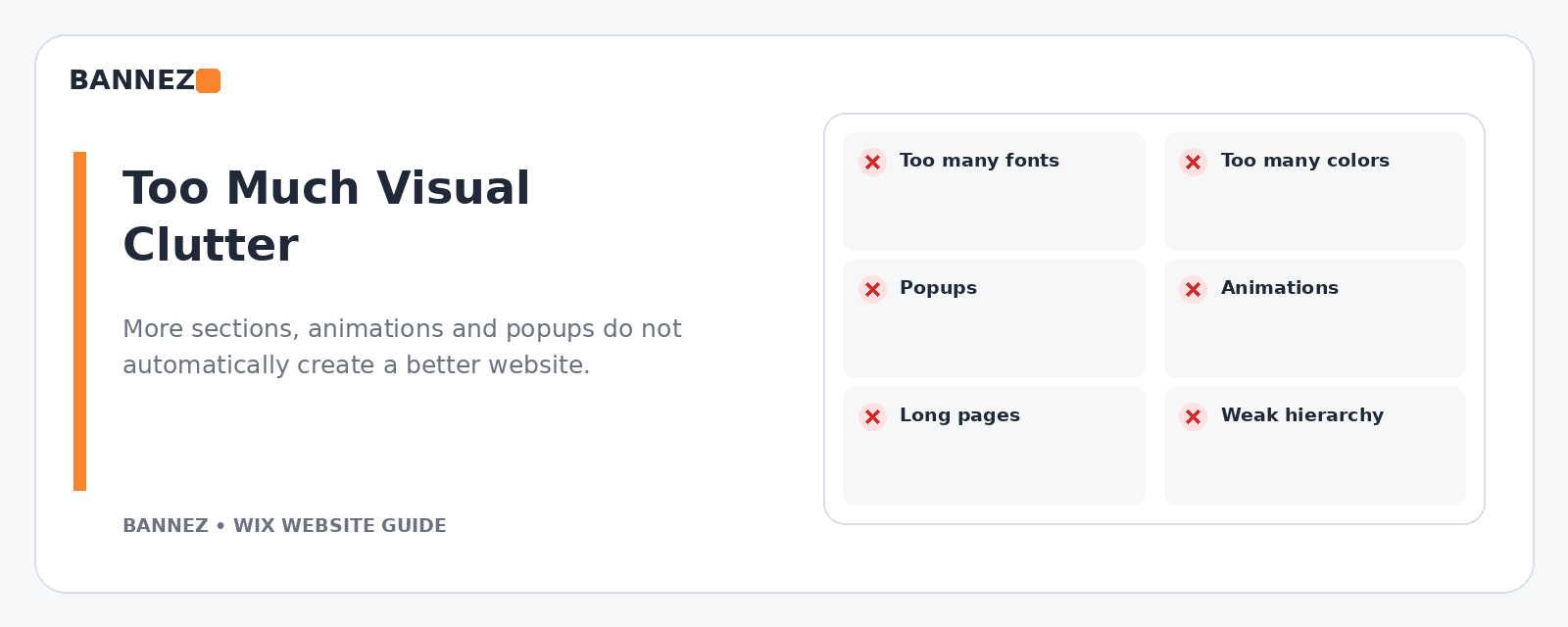
A homepage does not need to show every service, every review, every image, every blog post, and every promotion. Too many sections can make the page feel long and unfocused.
How to fix it
- Keep the main message near the top.
- Prioritize the most important services.
- Use one primary call to action.
- Move detailed information to dedicated pages.
- Remove sections that do not help a visitor decide what to do next.
2. Using Too Many Fonts and Colors
Different fonts, button styles, colors, shadows, and icon styles on every section make a website feel unfinished.
How to fix it
Create a simple design system with a small color palette, one or two readable font families, consistent button styles, and repeatable spacing rules.
3. Choosing a Template Only Because the Demo Looks Good
Template demos use carefully selected images and sample content. Your real business may have different text lengths, page types, services, and images.
How to fix it
Choose based on structure and features. Check service pages, mobile layouts, menus, contact sections, galleries, and any business functions you actually need.
4. Creating Confusing Navigation
Visitors should not have to guess where a service, contact form, or important page is located. Long menus and unclear labels add unnecessary effort.
Wix provides page and menu management tools, explained in its official Managing Your Site Pages guide and site menu documentation.
5. Using Weak Homepage Headlines
A headline such as “Welcome to Our Website” does not explain what the business does. The first message should help a new visitor understand the offer quickly.
How to fix it
Use a clear statement that describes the service, audience, or main benefit, followed by a short explanation and one useful next step.
6. Using Too Many Competing Calls to Action
If one section says “Learn More,” another says “Buy Now,” another says “Contact,” and another opens a popup, visitors may not know which action matters most.
How to fix it
Define one primary action for each page. Secondary links can support it, but they should not compete visually with the main goal.
7. Ignoring the Mobile Version
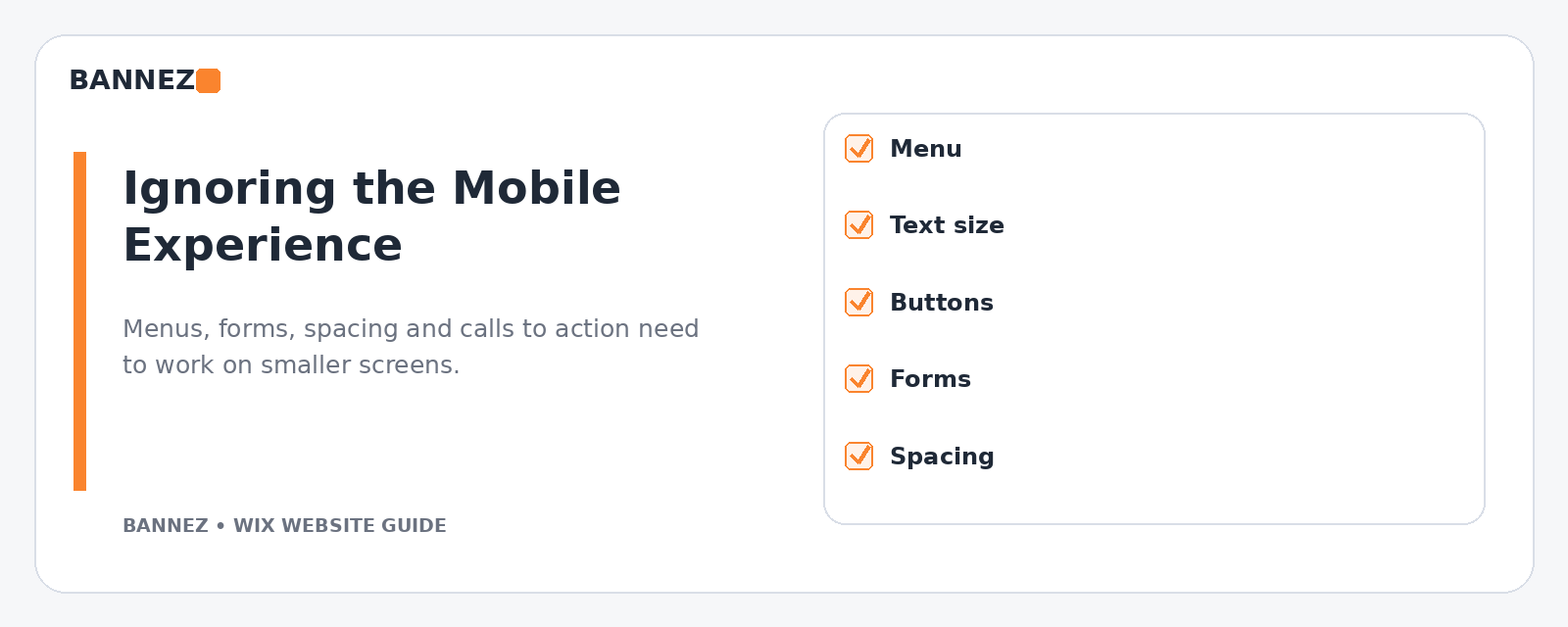
A desktop layout can look polished while the mobile version has large gaps, oversized headings, difficult buttons, awkward images, or overlapping elements.
Wix Editor creates a mobile-friendly version, but Wix recommends reviewing it through the mobile editor. Its official mobile version guide explains the process.
How to fix it
- Test the site on a real phone.
- Review the menu and header.
- Check button size and spacing.
- Make sure text does not wrap awkwardly.
- Reduce unnecessary mobile-only gaps.
- Check forms and popups.
8. Making Images Too Large or Inconsistent
Oversized images can dominate a page and create unnecessary scrolling. Different image ratios and quality levels can also make a site look inconsistent.
How to fix it
Use consistent image dimensions for similar content, crop images intentionally, and avoid making every visual full-width. Keep the image large enough to communicate clearly without letting it overwhelm the text.
9. Overusing Animation
Animation can help guide attention, but using it on every heading, button, image, and section makes a page feel busy and may add performance cost.
Wix recommends being selective with animations and heavy above-the-fold content in its site performance best practices.
How to fix it
Use movement only where it supports the experience. Static content is often more effective for important text and calls to action.
10. Adding Too Many Popups and Widgets
Chat, newsletter popups, cookie notices, discount boxes, social widgets, and promotional banners can all compete for screen space.
How to fix it
Keep only the tools that support a real business goal. Check how they behave on mobile, where screen space is limited.
11. Using Long Paragraphs With No Visual Hierarchy
Visitors scan web pages before reading them closely. Large blocks of text can make useful information harder to find.
How to fix it
- Use descriptive H2 and H3 headings.
- Keep paragraphs relatively short.
- Use bullets for lists.
- Highlight important actions naturally.
- Separate different topics into clear sections.
12. Hiding Important Information
Shipping details, service areas, pricing approach, process, contact information, or policy links should not be difficult to find when they affect a buying decision.
How to fix it
Place information close to the point where visitors need it. Use a footer for supporting links, but do not force customers to search for essential details.
13. Using Weak or Generic Service Pages
A page with a service name and one short paragraph rarely answers enough questions. It can also make SEO and internal linking more difficult.
How to fix it
Explain who the service is for, what is included, the problem it addresses, the process, and the next step. Add related internal links where they genuinely help the reader.
14. Forgetting Trust Information
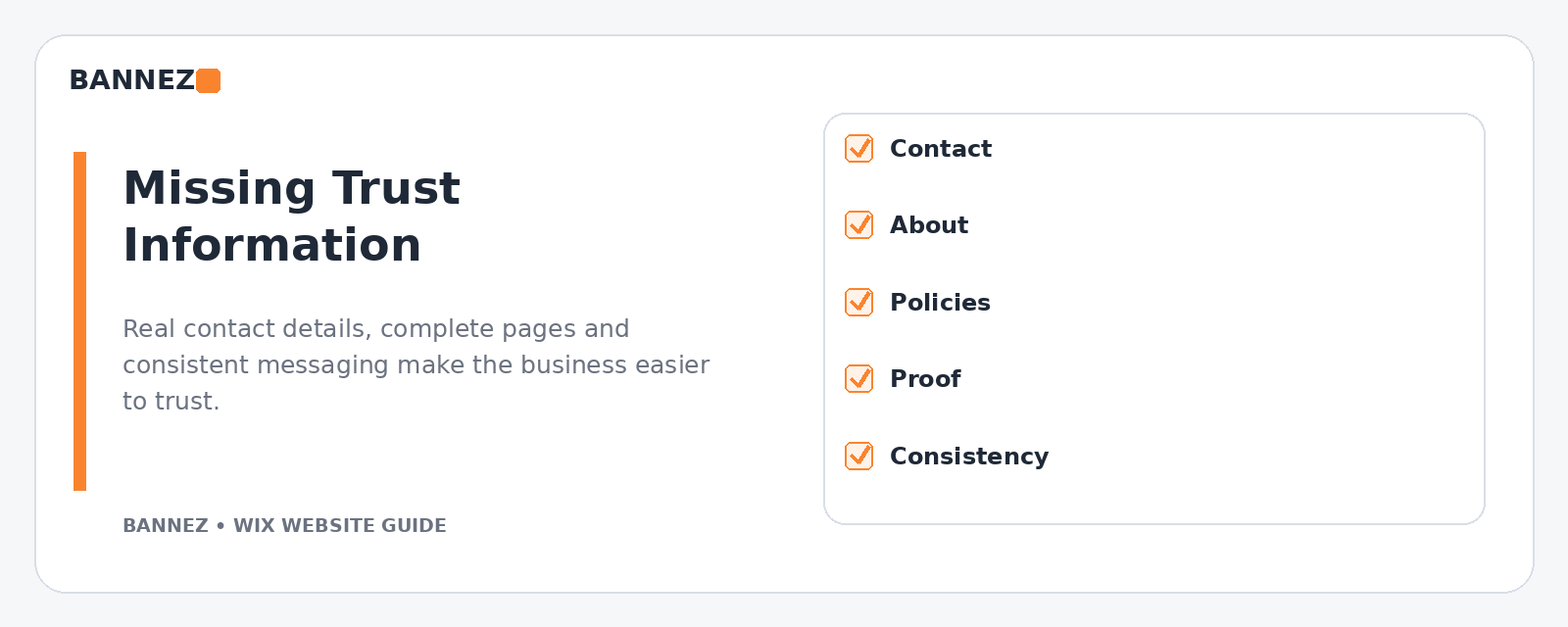
A beautiful website can still feel unreliable if contact information is missing, policies are unclear, claims are exaggerated, or testimonials look invented.
How to fix it
- Use accurate business information.
- Show real contact methods.
- Use genuine reviews and project examples.
- Keep policies clear and relevant.
- Avoid fake urgency, fake counters, or unsupported claims.
15. Ignoring SEO While Designing
Design decisions affect site structure. Important services should be easy to find, page topics should be clear, headings should be logical, and internal links should connect related information.
Wix provides an official SEO Setup Checklist to help with initial optimization tasks.
16. Publishing Without Testing Forms and Links
A polished website is not useful if the enquiry form fails or important buttons point to the wrong place.
Pre-launch test
- Click all menu links.
- Test every main CTA.
- Submit contact forms.
- Test phone and email links.
- Review mobile and desktop.
- Check bookings or ecommerce if used.
Quick Wix Website Design Audit
| Question | Good sign |
|---|---|
| Can a new visitor understand the business quickly? | Clear headline and service focus |
| Is navigation easy? | Short, familiar menu labels |
| Does mobile work well? | No overlapping, tiny, or oversized elements |
| Is the design consistent? | Repeatable fonts, colors, buttons, and spacing |
| Is trust information visible? | Accurate contact details and genuine proof |
| Are pages focused? | One clear goal per important page |
Professional Wix Design or Redesign Support
If your Wix site needs a cleaner design, improved mobile layout, better page structure, or a complete redesign, you can explore our Wix Website Design, Redesign & E-commerce Development service.
Frequently Asked Questions
Does a Wix website need lots of animations to look professional?
No. A professional site can be simple. Consistent typography, spacing, imagery, content, and clear customer paths usually matter more than visual effects.
Should every Wix page use the same layout?
Not exactly, but pages should follow the same design system. Related service pages can use a repeatable structure while special pages use layouts appropriate to their content.
Can too many Wix apps slow a website?
Third-party tools and scripts can add page work. Review every app or widget and keep only what the business actually needs.
What is the first design mistake I should fix?
Fix anything that blocks the customer journey first: broken links, unusable mobile layouts, failed forms, unclear navigation, or missing contact paths. Visual polish comes after usability.
Conclusion
Common Wix design mistakes usually come from adding more instead of making the experience clearer. Reduce clutter, simplify navigation, keep branding consistent, review mobile carefully, control heavy media, show real trust information, and make every important page support one clear goal.
Review your website as a new visitor rather than as the person who built it. That change in perspective often reveals the small design problems that create the most friction.
