
How to Make a Squarespace Website Mobile Friendly
A mobile-friendly Squarespace website is not simply a smaller version of the desktop page. Visitors on phones have less screen space, different reading habits, and less patience for difficult menus, tiny buttons, long paragraphs, or badly cropped images.
Squarespace uses responsive design, but your content and design choices still need careful mobile review. This guide explains how to make a Squarespace website mobile friendly without overcomplicating the layout.
1. Understand How Squarespace Responsive Design Works
Squarespace layouts are designed to adapt across screen sizes. The official Squarespace responsive design guide explains how content adjusts for different devices. Its mobile appearance documentation also describes how sites display on smaller screens.
Responsive does not mean every content choice will automatically look perfect. You still need to test the real page with your own headings, images, buttons, forms, and sections.
2. Simplify the Mobile Layout
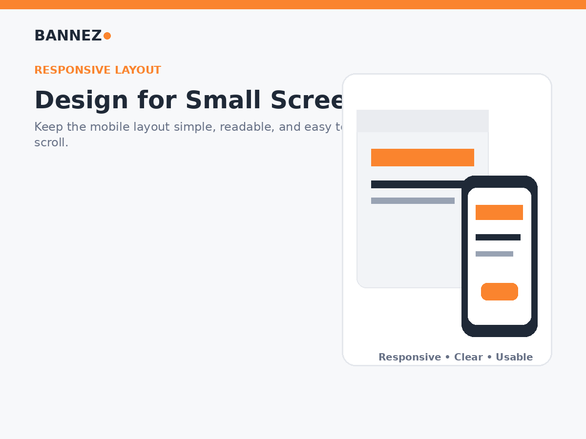
Layouts with many columns and decorative elements can become long or confusing when stacked vertically on a phone.
Keep mobile sections focused
- Use one main message per section
- Remove unnecessary decorative blocks
- Check the order of stacked columns
- Keep related content together
- Avoid very tall empty spaces
3. Keep Headlines Short Enough for Small Screens
A headline that fits on two lines on desktop may take five or six lines on a phone. Long headings can push the important content and call to action far down the page.
Improve mobile headings
- Use direct wording
- Remove unnecessary adjectives
- Keep one clear message
- Check line breaks on real devices
4. Make Body Text Easy to Read
Mobile visitors often scan before they read. Large walls of text make useful information harder to find.
Use mobile-friendly content formatting
- Short paragraphs
- Clear H2 and H3 headings
- Bulleted lists
- Numbered steps
- Simple tables only when they remain readable
- Enough spacing between content groups
5. Check Image Cropping
Images that look excellent on a wide desktop section may crop differently on a narrow phone.
Review important images for
- The main subject remains visible
- Text inside images remains readable
- Faces are not cut off awkwardly
- The image still supports the content
- File size is reasonable
6. Use Buttons That Are Easy to Tap
Calls to action should be easy to see and tap without accidentally touching another link.
Button checklist
- Use clear action text
- Give buttons enough spacing
- Avoid placing several small buttons tightly together
- Keep the main action visually clear
- Test buttons with one hand on a phone
7. Keep Mobile Navigation Simple
The menu should help visitors reach important pages without opening several unnecessary levels.
Prioritize these navigation goals
- Clear page labels
- Important services easy to reach
- Contact or booking path obvious
- No duplicate menu items
- Footer provides secondary links
8. Reduce Unnecessary Content Above the Main Message
On a phone, every extra banner, announcement, logo area, or decorative section takes valuable vertical space. Make sure visitors reach the main message quickly.
9. Optimize Forms for Mobile Use
Long forms can be frustrating on small screens. Ask only for the information needed for the next step.
Mobile form checklist
- Labels are clear
- Fields are easy to tap
- The form does not require unnecessary information
- Error messages are understandable
- The submit button is visible
- Success confirmation works
10. Check Section Spacing
Desktop spacing can feel excessive when every section stacks vertically. Review large top and bottom padding on a phone and make sure important pages do not become unnecessarily long.
11. Review the Order of Content
When desktop columns stack, the mobile content order may not match the order you expected.
Ask these questions
- Does the explanation appear before the button it supports?
- Does the image appear near the relevant text?
- Does important information come before optional details?
- Can a visitor understand the page while scrolling from top to bottom?
12. Avoid Important Information Only on Hover
Mobile users do not interact with websites in the same way as desktop users with a mouse. Important instructions, labels, or actions should not depend only on hover behavior.
13. Make Contact Actions Mobile Friendly
For local and service businesses, phone visitors may want to call, email, book, or find a location quickly.
Make sure users can easily find
- Contact page
- Phone number when relevant
- Email or form
- Booking link
- Address and directions when relevant
If you need professional help improving responsive layouts, mobile spacing, navigation, or other design issues, explore our responsive Squarespace website customization service.
14. Keep SEO and Mobile Usability Connected
Mobile-friendly content is also easier for people to understand. Keep page topics clear, use descriptive headings, write useful metadata, and avoid hiding important content inside decorative elements.
Squarespace’s official page settings guide covers URL and SEO-description controls.
15. Test on Real Devices
Editor previews are useful, but real-device testing can reveal issues you may miss during design.
Test at least these actions
- Open the menu
- Read the homepage from top to bottom
- Tap every important CTA
- Submit a form
- Check image crops
- Review service pages
- Check footer links
- Complete booking or checkout if the site uses it
Mobile-Friendly Squarespace Checklist
| Area | What to check |
|---|---|
| Layout | Sections stack in a logical order |
| Text | Headings and paragraphs are easy to read |
| Images | Important subjects remain visible |
| Buttons | Actions are easy to tap |
| Navigation | Main pages are easy to reach |
| Forms | Fields are simple and usable |
| Spacing | Pages are not unnecessarily tall |
| Testing | Important journeys work on real phones |
Frequently Asked Questions
Is Squarespace automatically mobile responsive?
Squarespace uses responsive design, but your actual content, section choices, image crops, and customizations still need mobile review.
Can I make desktop and mobile layouts completely different?
Squarespace’s options depend on the editor and section type. In many cases the best approach is to build a strong responsive structure rather than treating mobile as an unrelated second website.
Why does my Squarespace page look too long on mobile?
Large section padding, long text, many stacked columns, oversized images, or repeated content can make a page feel much longer on a phone.
Should I test only one phone size?
No. Test more than one screen size when possible, and at minimum use a real phone plus the platform’s preview tools.
Conclusion
To make a Squarespace website mobile friendly, simplify the layout, shorten long headings, improve text formatting, review image crops, use clear tap-friendly buttons, keep navigation simple, and test forms and content order on real devices.
Mobile optimization should be part of the normal design process, not a final repair step. Review mobile behavior whenever you add new pages, sections, campaigns, or major content so the website stays easy to use as it grows.
