
How to Make a WordPress Website Mobile Responsive
How to Make a WordPress Website Mobile Responsive
A mobile-responsive WordPress website adapts its layout, text, images, navigation, and controls to different screen sizes. It should not simply shrink a desktop page; it should remain readable, fast, and easy to use on phones and tablets.
This guide explains how to make a WordPress website mobile responsive and how to test the result before launch.
What Mobile Responsive Design Means
Responsive design uses flexible layouts, responsive media, and screen-based rules so the same website can adjust to available space. The content remains consistent, but its presentation may stack, resize, hide, or reorder appropriately.
1. Start with a Responsive Theme
Choose a maintained WordPress theme designed for current mobile devices. Preview its homepage, posts, pages, menus, forms, archives, and store pages before committing to it.
The official WordPress block theme documentation explains how block themes use the Site Editor, Styles, templates, and blocks to control site design.
2. Use Flexible Layouts
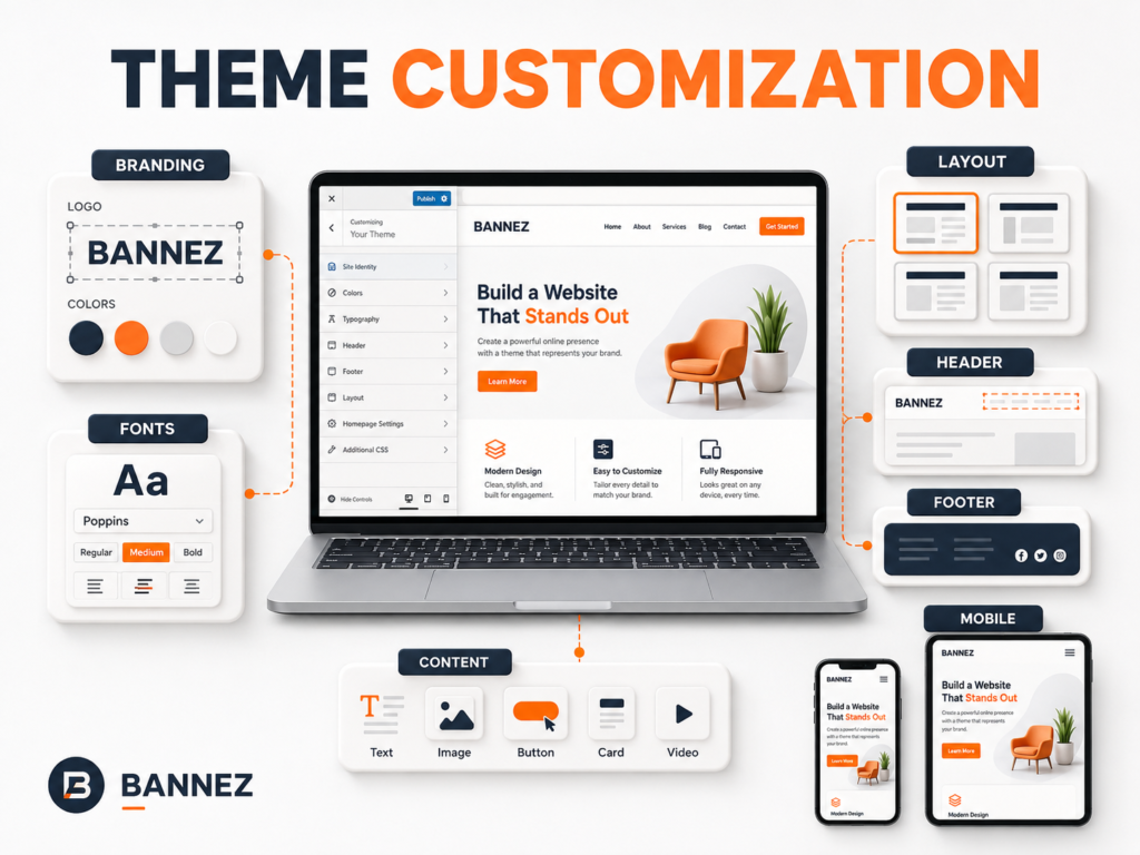
- Avoid fixed content widths wider than small screens.
- Let columns stack in a logical order.
- Use consistent spacing that can reduce on mobile.
- Prevent decorative elements from covering content.
- Check full-width sections for horizontal scrolling.
3. Set Responsive Typography
Headings and body text must remain readable without zooming. Use sensible line length, line height, and spacing. Very large desktop headings should scale down on smaller screens.
Check Every Text Element
- Headings and paragraphs
- Buttons and menu labels
- Forms and error messages
- Tables, captions, and prices
- Footer and legal text
4. Optimize Images and Video
Use responsive image markup provided by WordPress, upload correctly sized source files, and avoid placing important text inside images. Videos and embeds should fit their container without forcing horizontal scrolling.
- Compress images before upload.
- Use suitable modern formats when supported.
- Set meaningful alt text.
- Choose a mobile-friendly crop when the main subject would otherwise disappear.
- Lazy-load off-screen media where appropriate.
5. Build a Mobile-Friendly Menu
The mobile menu should open quickly, show clear labels, support submenus, and close reliably. Avoid placing too many items at the top level.
Mobile Navigation Checklist
- Menu button is easy to find and tap.
- Open/close state is clear.
- Dropdowns do not run off screen.
- Important action remains visible.
- Keyboard focus works logically.
6. Make Buttons and Links Easy to Tap
Use adequate button size and spacing so people do not tap the wrong action. Avoid placing several small text links tightly together. Make the button label describe the action.
7. Improve Mobile Forms
- Use clear labels above or beside fields.
- Ask only for necessary information.
- Use suitable field types for email, phone, and numbers.
- Show validation errors near the related field.
- Keep the submit button visible and easy to tap.
- Test the keyboard and autofill experience.
8. Handle Tables and Wide Content
Large tables, code blocks, comparison charts, and embedded widgets can overflow. Simplify the information, allow controlled horizontal scrolling, or present key details as stacked cards on small screens.
9. Review Header, Footer, and Sticky Elements
A large desktop header can consume most of a phone screen. Reduce unnecessary height and check sticky headers, chat widgets, cookie banners, popups, and floating buttons for overlap.
10. Use Breakpoints Carefully
Breakpoints should respond to content needs, not only popular device names. Test around the widths where navigation wraps, columns become crowded, or headings break awkwardly.
11. Avoid Hiding Essential Content
Removing decorative elements on mobile can improve clarity, but do not hide important information, contact methods, pricing details, form instructions, or primary calls to action.
12. Test Real Pages on Multiple Devices
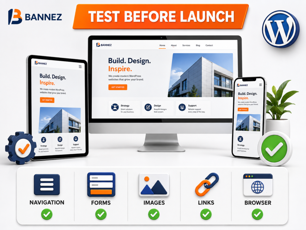
| Test area | What to check |
|---|---|
| Layout | No overlap, clipping, or horizontal scrolling |
| Typography | Readable text and sensible line breaks |
| Navigation | Menu and submenus work |
| Forms | Fields, keyboard, errors, and delivery work |
| Media | Images and videos fit correctly |
| Interactions | Buttons, sliders, tabs, and popups are usable |
| Performance | Pages load acceptably on mobile networks |
13. Check Mobile Performance
Mobile devices and networks may be slower than desktop environments. Reduce large images, unused scripts, excessive animations, and unnecessary plugins. Use caching and a CDN where appropriate.
14. Test Accessibility Basics
- Text has sufficient contrast.
- Focus indicators are visible.
- Menus and forms work with a keyboard.
- Meaning is not communicated by color alone.
- Zoom does not break the layout.
- Buttons have clear accessible names.
Mobile Responsive WordPress Checklist
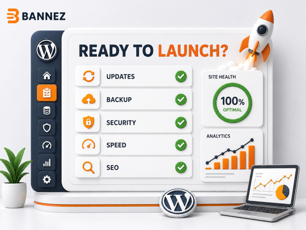
- ☐ Responsive theme and templates used
- ☐ Columns stack logically
- ☐ Text remains readable
- ☐ Images and videos fit containers
- ☐ Menu and submenus work
- ☐ Buttons and links are easy to tap
- ☐ Forms work with mobile keyboards
- ☐ Tables and widgets do not overflow
- ☐ Sticky elements do not cover content
- ☐ Important content is not hidden
- ☐ Real devices and browsers tested
- ☐ Mobile performance reviewed
Professional Responsive WordPress Development
If you need a new responsive blog website, explore our Create a Fast & Responsive WordPress Blog Website service. For an existing theme requiring broader layout changes, review our WordPress theme customization service.
Frequently Asked Questions
Why does my WordPress site look good on desktop but bad on mobile?
Fixed widths, oversized text, unresponsive media, crowded menus, builder settings, custom CSS, or plugin widgets may not adapt correctly.
Can a plugin make any website responsive?
No. A plugin may help specific elements, but responsive design depends on the theme, templates, content, CSS, media, and third-party widgets.
Should mobile and desktop content be identical?
The essential information should remain consistent, but layout and presentation can change to improve usability.
Conclusion
Mobile responsiveness requires more than one setting. Use flexible layouts, readable typography, responsive media, usable navigation, accessible controls, and structured testing.
Review every important page on real small screens and fix the complete visitor journey—from opening the menu to submitting the final form.
