
Why Mobile-Friendly Website Design Matters
Mobile-friendly website design is no longer an optional extra for a business website. Visitors may reach the same page from a phone, tablet, laptop, or large desktop screen, and the website should remain readable, usable, and clear across those devices.
A mobile-friendly site is not simply a desktop page made smaller. It should adapt its layout, navigation, typography, images, forms, and calls to action so people can use the site comfortably on a narrower screen.
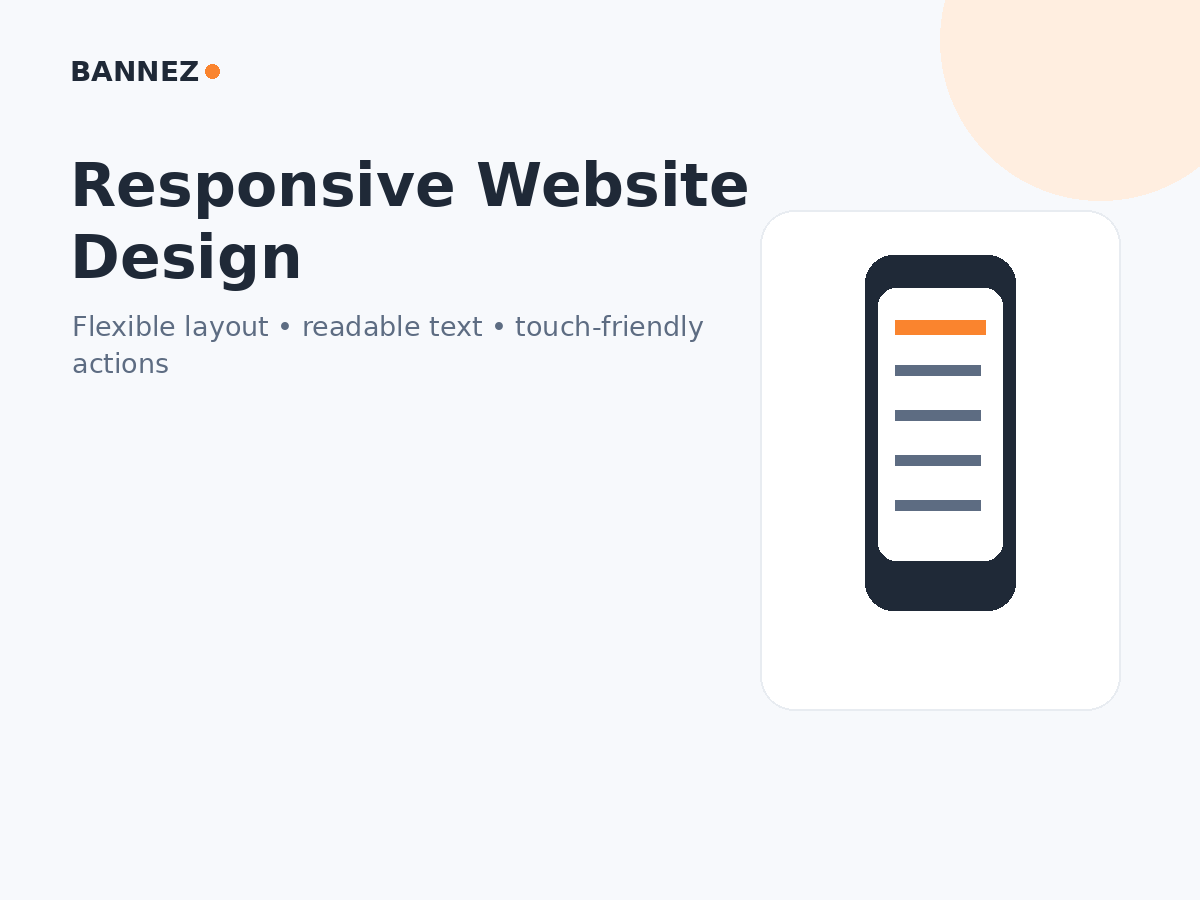
What Is Mobile-Friendly Website Design?
A mobile-friendly website provides a usable experience on smaller screens without forcing visitors to zoom constantly, scroll sideways, or fight with tiny controls.
Common mobile-friendly characteristics
- Responsive page layouts
- Readable text
- Touch-friendly buttons and links
- Menus that work on small screens
- Images that scale correctly
- Forms that fit the viewport
- Important content that is not hidden
1. Mobile Visitors Need the Same Core Information
Do not treat mobile visitors as a secondary audience. They should be able to understand your offer, review services, see prices or important details, contact the business, and complete key actions without switching to a desktop computer.
2. Responsive Design Improves Usability
A responsive layout changes according to available screen space. Columns may stack, menus may collapse, images may resize, and spacing may change.
The goal is not to make every device look identical. The goal is to maintain the same information and purpose in a format that works for each screen.
3. Mobile Design Affects Navigation
A large desktop menu cannot always be copied directly onto a phone. Mobile navigation should remain easy to open, understand, and close.
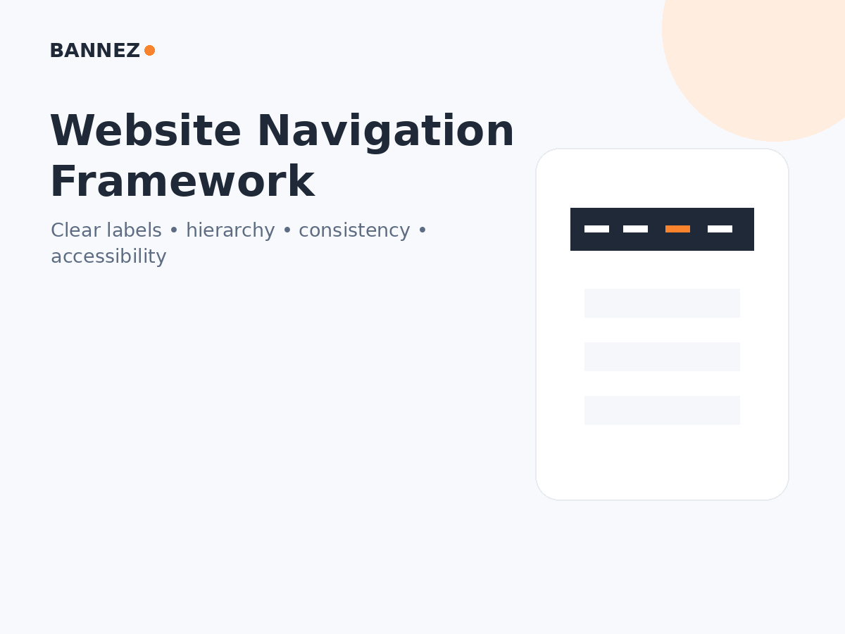
W3C’s current menu accessibility tutorial provides guidance for navigation that works across different interaction methods.
4. Mobile Forms Need Extra Attention
Long forms feel even more difficult on a small screen. Ask only for information the business genuinely needs, use clear labels, and make validation messages easy to understand.
W3C’s updated forms guidance recommends simple, short forms and useful labels, instructions, validation, and notifications.
5. Mobile Page Speed Matters
Mobile visitors may be on slower or less stable networks. Heavy images, video backgrounds, too many scripts, and unnecessary widgets can make the experience feel slow.
Google’s current Core Web Vitals guidance focuses on real-user loading performance, responsiveness, and visual stability.

6. Mobile Usability Is Part of Overall Page Experience
Google’s current page experience documentation encourages site owners to consider whether pages display well on mobile devices as part of the complete user experience.
Google no longer provides the old Mobile-Friendly Test tool as the central test it once was, so use current browser testing, Lighthouse, real devices, and your own usability checks rather than depending on one retired score.
7. Mobile-Friendly Design Supports Conversions
A visitor may be interested in your offer but still leave when the conversion path is difficult on a phone. Common problems include tiny buttons, forms that require too much typing, hidden pricing, overlapping popups, and checkout layouts that do not fit the screen.
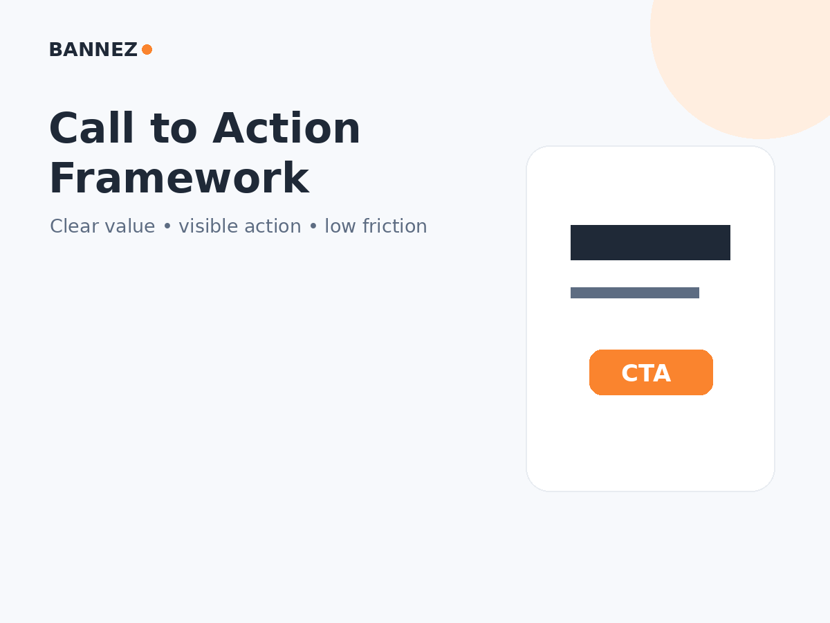
Read How to Reduce Friction on Your Website.
8. Responsive Design Helps Maintain Brand Consistency
Mobile should still look and feel like the same business. Keep brand colors, tone, logo use, typography hierarchy, and key visual patterns consistent while adapting the layout.
Common Mobile Design Problems
| Problem | Effect |
|---|---|
| Horizontal scrolling | Visitors cannot comfortably read the page |
| Tiny tap targets | Buttons and links are hard to use |
| Large popups | Main content becomes difficult to access |
| Slow images | Important content appears late |
| Desktop-only forms | Typing and submission become frustrating |
| Hidden CTAs | Visitors cannot find the next step |
How to Test a Website for Mobile Friendliness
- Open every important page at a narrow screen width.
- Test on at least one real phone if possible.
- Open and close the navigation menu.
- Try every major CTA.
- Complete each important form.
- Check text without zooming.
- Rotate the device and check layout changes.
- Review loading and layout stability.
- Check whether sticky bars cover content.
- Test checkout or booking flows where relevant.
Mobile-Friendly Does Not Mean Mobile-Only
Do not optimize for phones by making desktop users worse. Responsive website design should support the range of screens your audience actually uses.
Where Bannez Can Help
If you need a responsive WordPress business website and the service scope matches your project, you can explore our Professional WordPress Business Website service. For a WordPress blog-focused project, our Fast & Responsive WordPress Blog Website service may be relevant.
For other platforms, Bannez also provides Wix Website Design & Redesign and Responsive Squarespace Website services where the listed scope fits.
Mobile-Friendly Website Checklist
- No horizontal scrolling
- Text readable without zooming
- Buttons easy to tap
- Navigation works correctly
- Images scale properly
- Forms are short and usable
- CTAs remain visible
- Popups do not block the main content
- Pages load reliably
- Desktop and mobile contain the same essential information
Frequently Asked Questions
Is responsive design the same as mobile-friendly design?
Responsive design is a common method used to create a mobile-friendly experience by adapting the layout to available screen space.
Does Google require a separate mobile website?
No. A separate mobile domain is not required. A responsive site can serve mobile users effectively when implemented correctly.
Should I hide content on mobile to make the page shorter?
Do not hide important information simply because the screen is smaller. Prioritize and restructure content while keeping essential information accessible.
How can I check mobile performance?
Use real-device testing, browser responsive tools, Lighthouse, and field performance data where available. Do not rely on one test alone.
Conclusion
Mobile-friendly website design matters because visitors should not have to change devices to use your business website. The experience should remain clear, readable, fast enough, and easy to navigate from a phone.
Test your most important pages and conversion paths on real mobile layouts. Fix the problems that make visitors zoom, wait, hunt for information, or struggle to take action.
