
What Is a Call to Action and Why Does Your Website Need One?
A call to action, often shortened to CTA, tells a visitor what useful step they can take next. Without a clear next step, even interested visitors may read a page, understand the offer, and then leave because the website never shows how to continue.
A CTA can be a button, text link, form prompt, phone action, checkout button, booking link, download, signup, or another meaningful next step. The right CTA depends on the purpose of the page.
What Is a Call to Action?
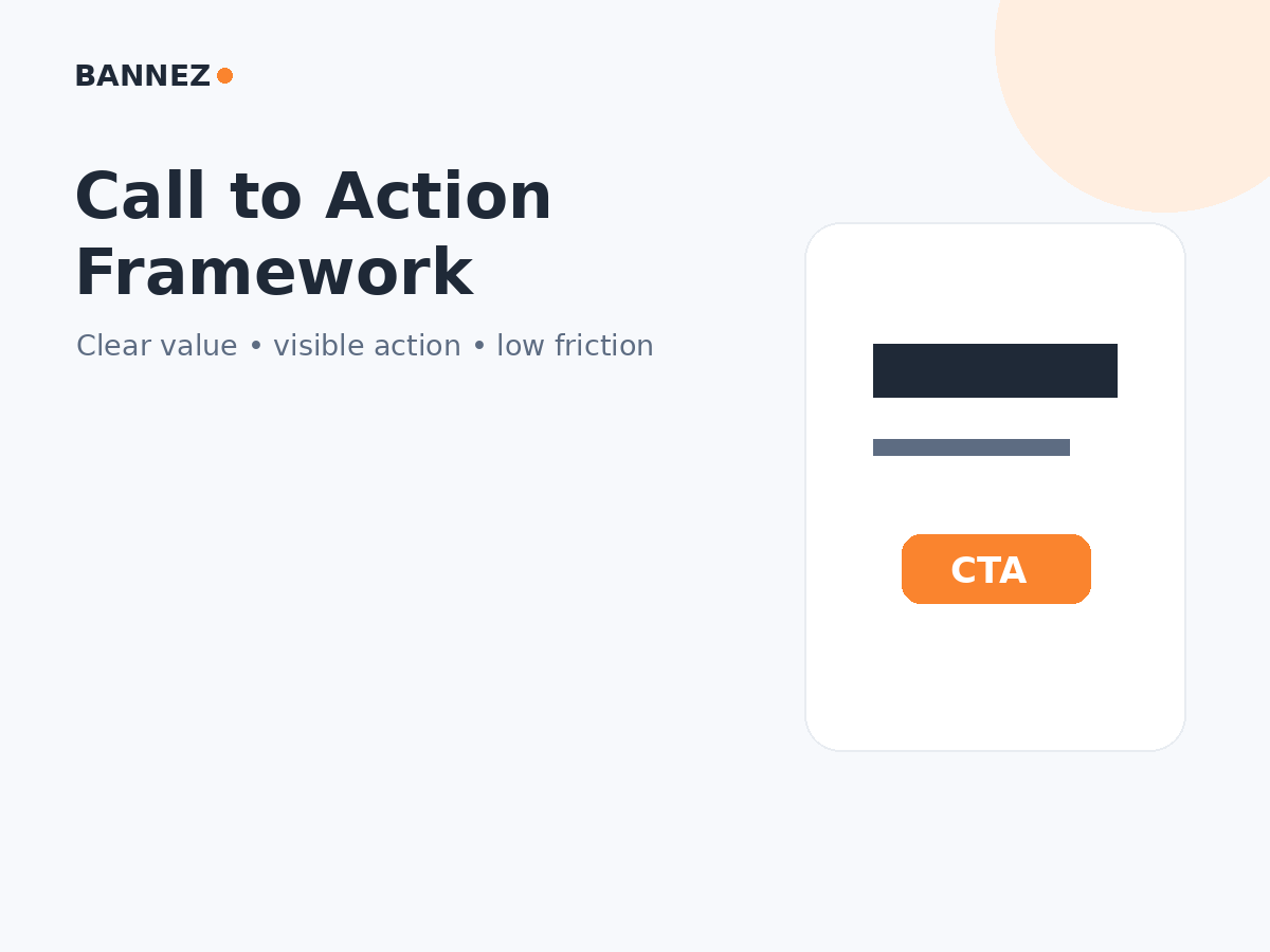
A call to action is an instruction or control that encourages a visitor to complete a specific next step.
Common website CTA examples
- Request a Quote
- Contact Us
- Book a Consultation
- Start Free Trial
- Add to Cart
- Buy Now
- Download the Guide
- Create an Account
- Subscribe
- View Services
Why Does a Website Need a CTA?
1. It creates direction
A page should not make visitors guess what to do after reading. A clear CTA connects information to action.
2. It supports business goals
Different websites care about different actions. A service business may prioritize enquiries, while ecommerce prioritizes purchases and a publisher may prioritize subscriptions.
3. It makes conversion paths measurable
In Google Analytics 4, important business actions can be marked as key events. This lets you connect website traffic with meaningful outcomes.
CTA vs Conversion: What Is the Difference?
A CTA invites the action. A conversion is the meaningful outcome you measure.
For example, “Request a Quote” is the CTA. A successfully submitted quote form may be the conversion or key event.
Where Should Calls to Action Appear?
There is no universal perfect position. Place CTAs where they are useful in the visitor journey.
Common placements include
- Hero section
- After explaining the main benefit
- After pricing or service details
- After proof or testimonials
- At the end of an article or page
- Inside a sticky mobile action when appropriate
The CTA should appear when the visitor has enough context to understand what will happen next.
Primary vs Secondary CTA
A primary CTA represents the most important action on the page. A secondary CTA offers a useful alternative for people who are not ready for the main step.
| Page | Primary CTA | Possible secondary CTA |
|---|---|---|
| Service page | Request a Quote | View Portfolio |
| SaaS page | Start Trial | Watch Demo |
| Product page | Add to Cart | View Details |
| Blog article | Relevant service/action | Read related guide |
What Makes a CTA Clear?
Use action-focused wording
“Submit” tells the visitor less than “Request My Quote” or “Create Account.” The button should describe what happens.
Match the CTA to the page
A visitor reading an early educational article may need a softer next step than someone on a pricing or checkout page.
Make it visually noticeable
The CTA should have enough visual contrast to be found without competing with every other element on the page.
Set correct expectations
Do not label a button “Download Free Guide” if it unexpectedly starts a paid checkout. Clear expectations support trust.
Calls to Action and Landing Pages
Landing pages often have one dominant CTA because the page is designed around a narrow campaign objective. A full website may have different CTAs for different pages and visitor stages.
Read Landing Page vs Website: What Is the Difference?.
CTA Forms Should Be Easy to Complete
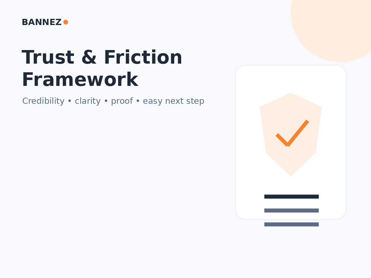
A strong button can still fail when the next form creates too much friction. W3C’s updated forms guidance recommends simple, short forms and asking only for information that is actually required.
Form improvements may include
- Fewer unnecessary fields
- Clear labels
- Useful instructions
- Accessible validation
- Clear success confirmation
Common CTA Mistakes
- No clear CTA on important pages
- Too many competing primary buttons
- Vague wording
- CTA unrelated to page intent
- Button difficult to see
- CTA hidden on mobile
- Action leads to a broken form
- Unexpected next step
- Using fake urgency

How to Improve a Website CTA
- Define the page’s main objective.
- Choose one primary action.
- Write a descriptive CTA label.
- Place it where visitors have enough context.
- Check visual contrast and spacing.
- Test it on mobile.
- Complete the full form or checkout yourself.
- Track the important outcome.
- Compare performance before and after meaningful changes.
How to Measure CTA Performance
Do not judge a CTA only by clicks. A button can receive many clicks while the form, checkout, or next page fails.
Measure the full path
- CTA clicks
- Form starts
- Form completions
- Checkout starts
- Purchases
- Bookings
- Other key events
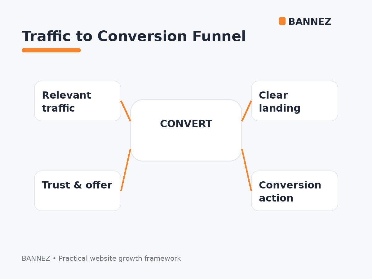
For the broader relationship, read Website Traffic vs Conversions: What Matters More?.
CTA Checklist
- Main page goal is clear
- Primary CTA matches the goal
- Button text describes the action
- CTA is easy to find
- Mobile placement works
- Next step matches expectations
- Forms are short and accessible
- Important outcomes are tracked
- No fake urgency or misleading claims
Frequently Asked Questions
How many CTAs should a page have?
There is no fixed number. A page can repeat the same primary CTA where useful, but avoid creating many competing actions that make the main next step unclear.
What color should a CTA button be?
There is no universal best color. Use a color that fits the brand and has enough contrast from the surrounding design.
Should every blog post have a CTA?
A relevant next step can be helpful, such as reading a related guide or exploring a related service. Do not force a sales CTA when it does not match the reader’s intent.
Can a text link be a CTA?
Yes. A CTA describes the function, not only the visual style. Buttons are common for primary actions, while contextual text links can support secondary actions.
Conclusion
A call to action connects understanding with a useful next step. It should be clear, relevant, visible, and honest about what happens after the click.
Choose CTAs based on the purpose of each page, test the complete conversion path, and measure meaningful outcomes rather than button clicks alone.
